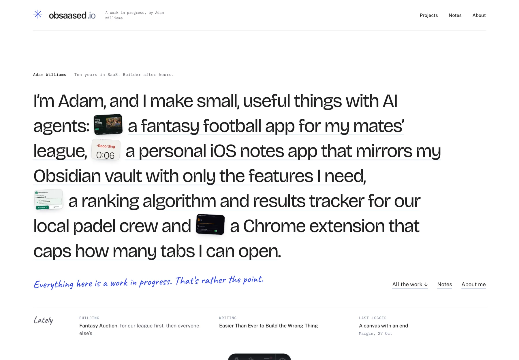
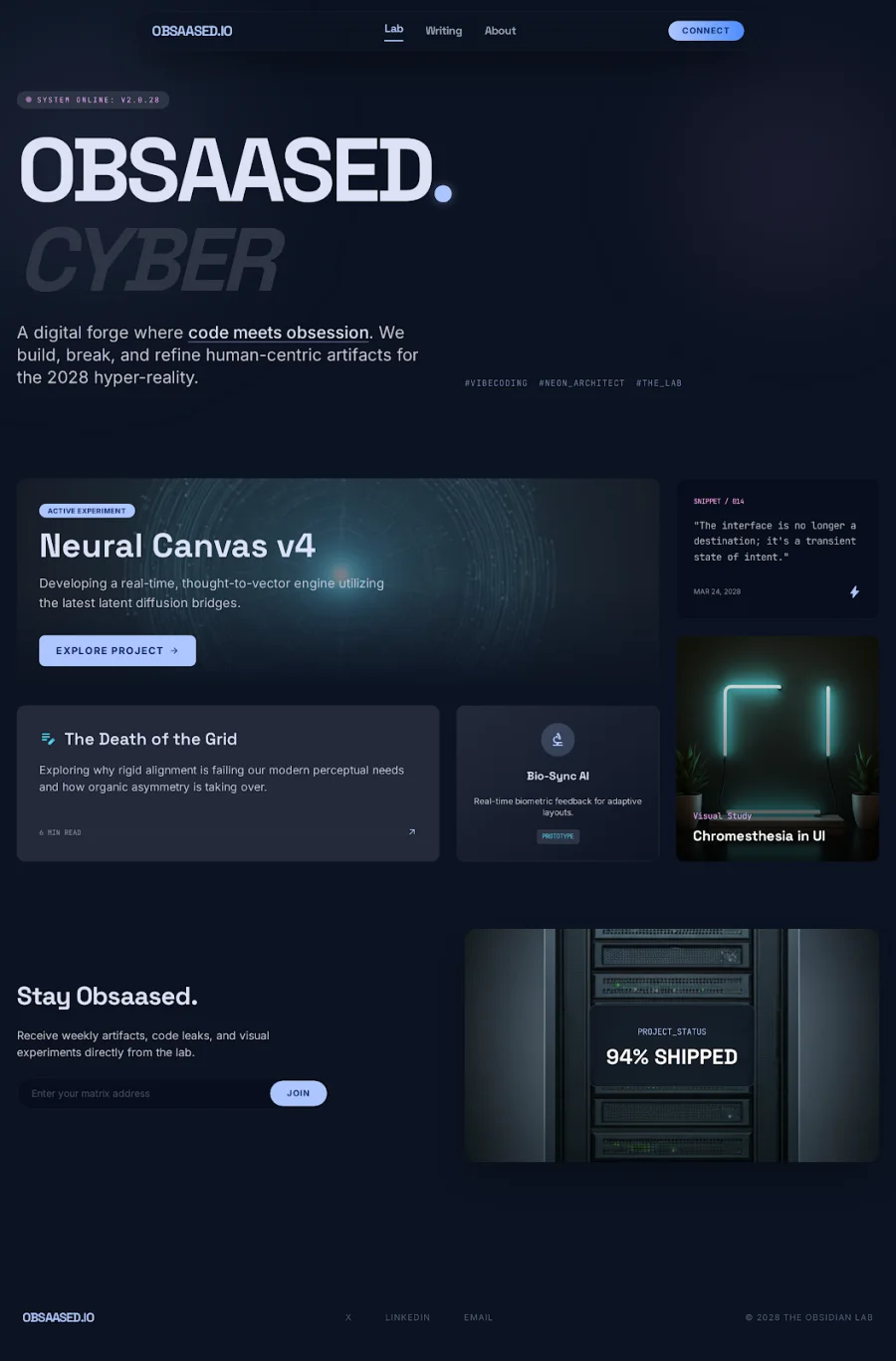
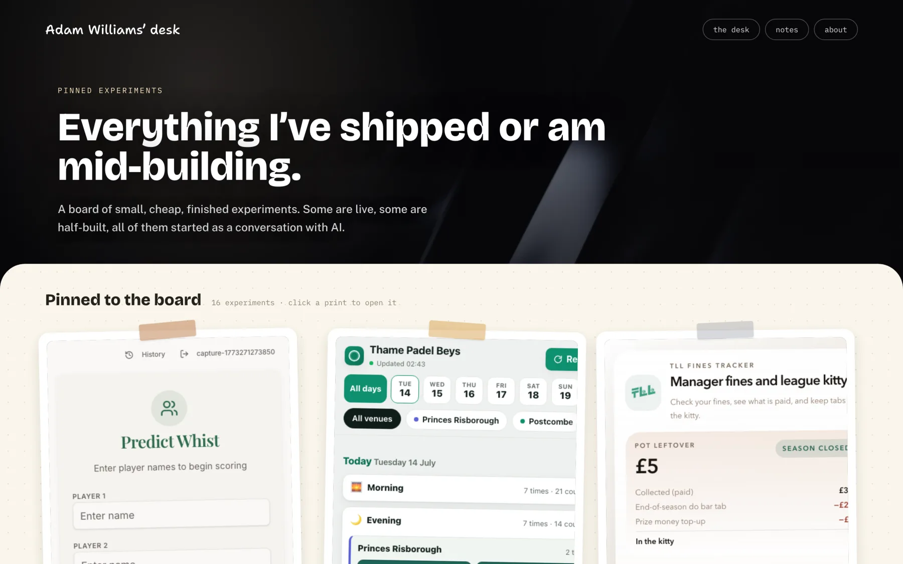
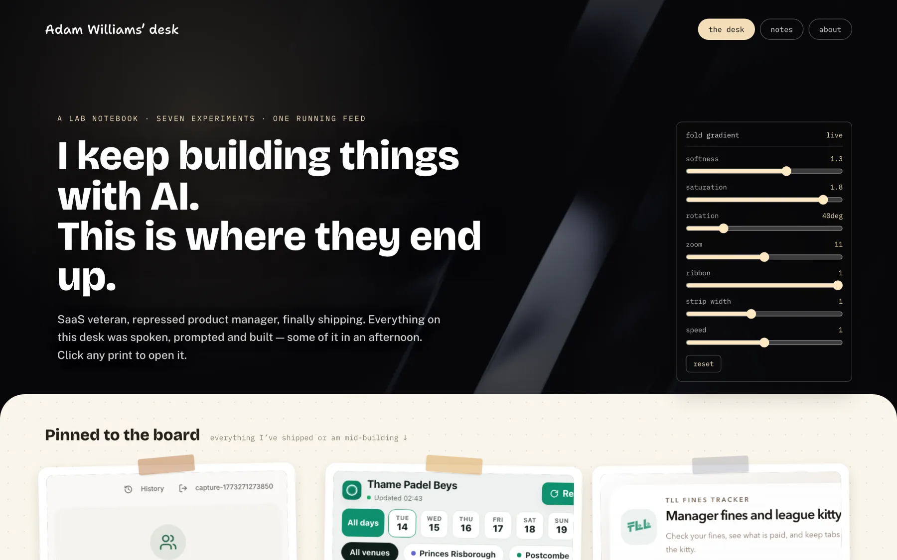
July was the desk. A noir masthead, warm dotted paper, projects as taped prints with little rotations and notes as lined paper cards. And behind every page, a fold-gradient shader.
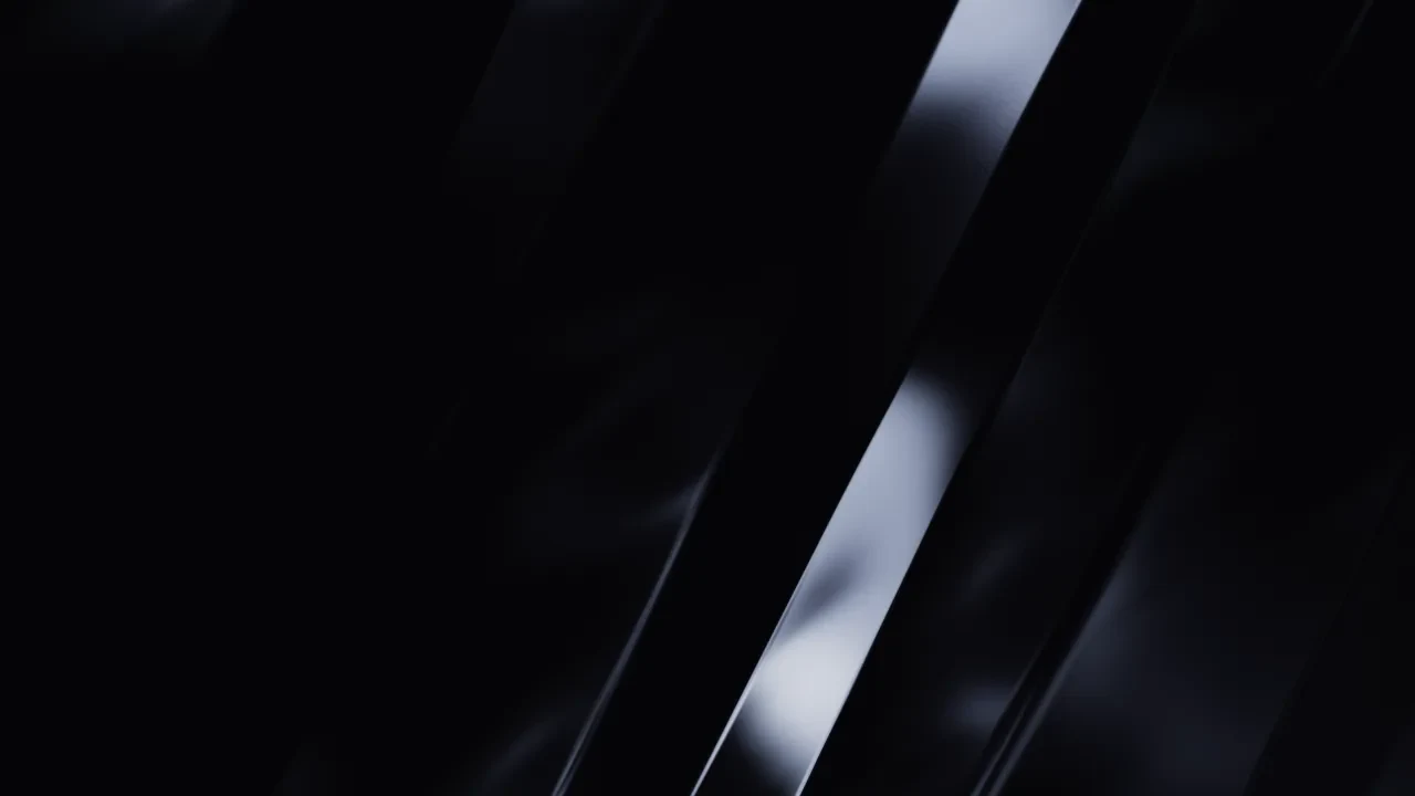
The shader was my distraction. It’s a real WebGL fragment shader, folded ribbons of colour drifting slowly, and I gave the homepage seven sliders for softness, saturation, rotation, zoom, ribbon, strip width and speed. Then I spent far too long tuning it. When it made scrolling heavy, an agent lowered the resolution to fix it, and I noticed straight away on a retina screen. The grain went soft, so that change was reverted. The fix that stuck was pausing it while you scroll, stopping it when it’s off screen and showing a still image on phones.
In September I swung the other way. A refined field notebook in warm ivory, ink and rust, with serif headlines and no animation. It looked fine. It wasn’t me, and it lasted about a week. The replacement went loud on purpose: white, ink and cobalt, then acid yellow and coral, oversized type and staggered project cards, with the stories of what I learned treated as seriously as what I shipped.
Every one of those is a dated design doc in the repo. Reading them back, the pattern is obvious. I keep bouncing between techy, personal, writing-first and showing the work.